中文等宽字体(Monospace Chinese Font Family)
中文等宽字体,一个中文字符等宽两个英文字符,Mac下很多字体( Menlo, Monaco, Courier New, Source Code Pro )没有严格遵循或者说达不到这个标准, 它们不包括CJK的字库,有的时候用 markdown table formatter 进行格式化会导致不整齐,其实并不是排列不整齐,而是字体的宽度不同
即使排列好,但是中英文宽度没有对齐,就会不整齐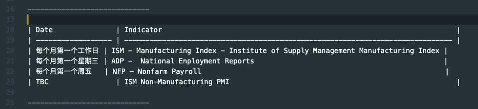
使用了 Sarasa Mono SC, 排列就会变得整齐了, 而且并没有重新排列
Sarasa Gothic (更纱黑体 / 更紗黑體 / 更紗ゴシック / 사라사고딕)
SARASA GOTHIC, a CJK programming font based on Iosevka and Source Han Sans.
Installation
如果是在 Windows 或者 Linux 上使用,直接下载 TTF 文件安装即可
Download sarasa-gothic-ttf from Sarasa Gothic
安装 Sarasa Mono SC,regular/light/bold/italy 即可
在你需要用到这个字体的编辑器里面设置字体为 Sarasa Mono SC, Size 最好的16以上
如果是在 MacOS 上使用 Homebrew Cask 安装更方便:
1 | # 安装 Sarasa Gothic 的全部字体 |
Sarasa Mono SC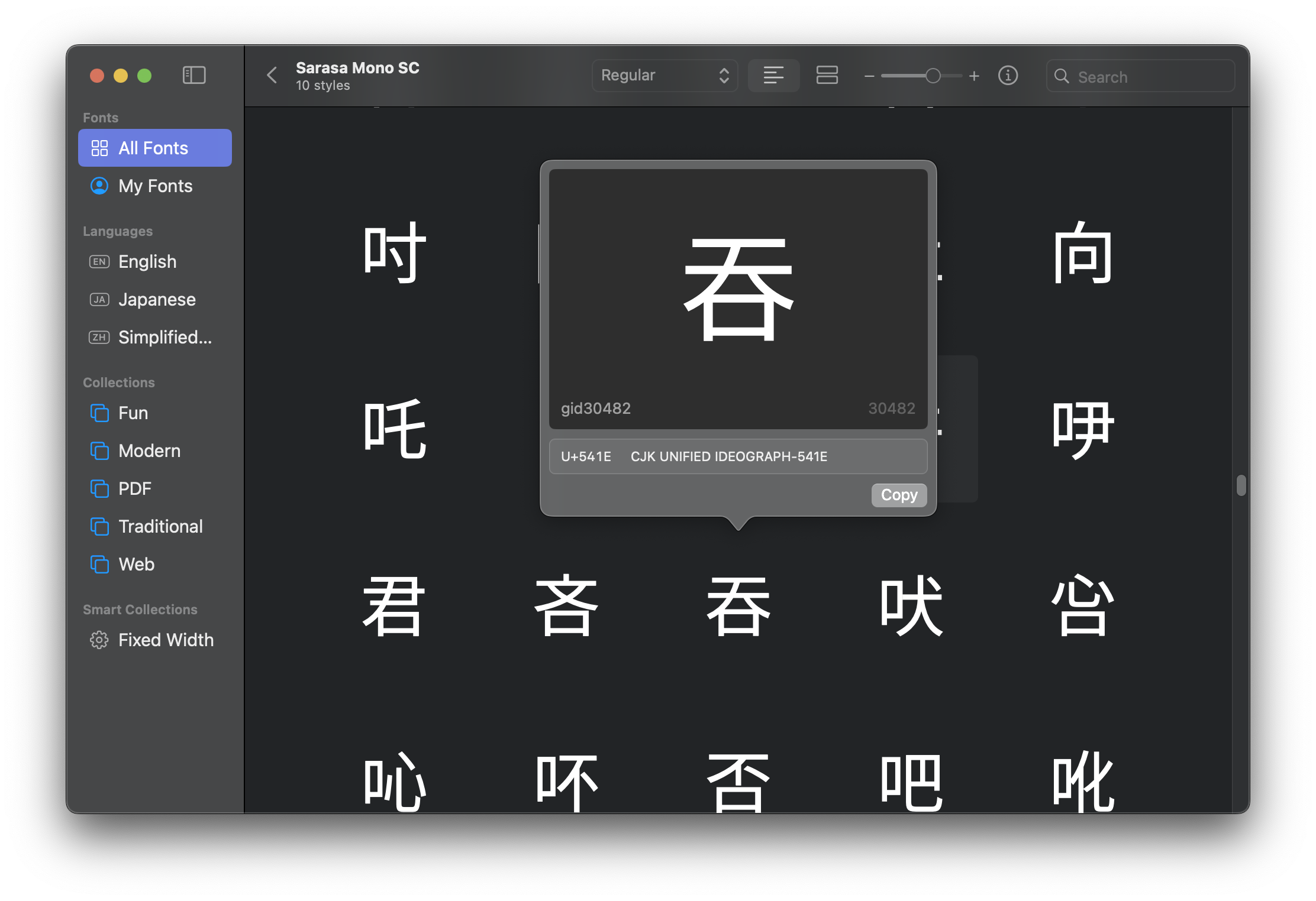
Noto Sans CJK
2014年 Google 和 Adobe 宣布合作推出一款免费、开源的字体——Noto,Noto 是 Google 的一个字体系列,它几乎包含了所有主流语言文字。Noto Sans 是 Noto 的无衬线字体系列,Noto Sans CJK 是包含了 Chinese/Japanese/Korean 三种变体的无衬线字体
Installation
如果是在 MacOS 上使用 Homebrew Cask 安装更方便:
1 | ❯ brew install --cask font-noto-sans-cjk |
如果是在 Windows 或者 Linux 上使用,直接 Google Fonts 下载安装即可
Noto Sans Mono CJK SC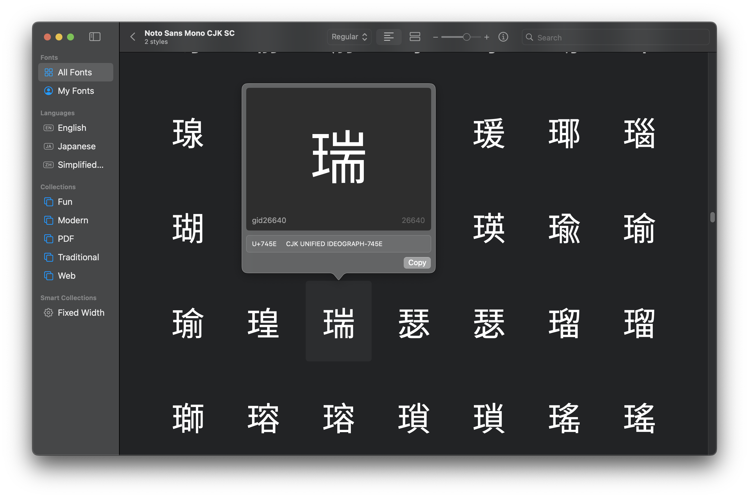
J/K/SC/TC 的区别
Noto Sans Mono CJK SC 后面的 SC 就是简体中文 ( Simplified Chinese ) 的意思, 其他的还有 J ( Japanese 日文 ), K ( Korean 韩文 ), TC ( Traditional Chinese 繁体中文 )
不同字体文件格式之间的区别
TTC 和 TTF
在 更纱黑体 的 Release 下面有两种格式( TTC 和 TTF ), 它们的区别如下:
1 | A TrueType Collection (TTC) is a means of delivering multiple TrueType fonts |
TTF,OTF,TTC,Super TTC/OTC 的区别
| 格式 | 可包含字体数量 | 曲线类型 | 历史 | 文件扩展名 |
|---|---|---|---|---|
| TTF | 1 | 二次贝塞尔 | 1980s 末期由 Apple & Microsoft 推出 | .ttf |
| OTF | 1 | 二次或三次贝塞尔(CFF) | 1990s 后期由 Microsoft & Adobe 推出 | .otf |
| TTC | 多个 TTF | 二次贝塞尔 | 1990s 中期为节省多字重空间而生 | .ttc |
| Super TTC / OTC | 多个 TTF/OTF | 混合 | 2010s 起由 Apple 推行(如 PingFang.ttc) | .ttc / .otc |
最后的反思
需要反思另一个问题,就是字体渲染效果是否符合你的审美,有时候不见得绝对等宽就是好,如果不用绝对等宽但是结果有个八成满意,但是同时字体更好看些,也是一种取舍, 但是这个问题要交由每个人去权衡 …
Limited in Markdown Files
等宽字体长期对着屏幕写代码其实并不舒服,所以可以把等宽中文限制只限制在markdown文档里面
在 ~/Library/Application Support/Code/User/settings.json 这个 vscode settings json 里面添加
1 | "[markdown]": { |
TO BE CONTINUED
Reference
更纱黑体
https://github.com/be5invis/Sarasa-Gothic
Noto
https://fonts.google.com/noto/use
Monospaced font
https://en.wikipedia.org/wiki/Monospaced_font
TrueType
https://en.wikipedia.org/wiki/TrueType
思源黑体的发布
https://blog.typekit.com/alternate/source-han-sans-chs/
Noto CJK 字体库
https://github.com/notofonts/noto-cjk
Install and validate fonts in Font Book on Mac
https://support.apple.com/guide/font-book/install-and-validate-fonts-fntbk1000/mac